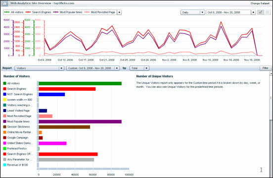
As its name implies, the Site Overview Report gives you an overview of many of your most important metrics. The report consists of two sections: a Key Performance Indicator (KPI) graph, and a Report section where you can view sixteen different reports.

To view the Site Overview Report
1. In the side navigation bar, click Web Analytics.
2. Click Site Overview.
The Key Performance Indicators (KPI) Graph
The purpose of the Key Performance Indicators (KPI) graph is to show you immediate feedback on your most important KPIs when you view the Site Overview Report. You can display up to four KPIs at one time.

To change the settings for the key performance indicator (KPI)
1. Click the button next to All visitors.

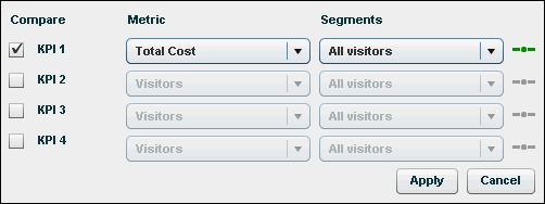
The KPI dialog appears
You can do either or both of the following:
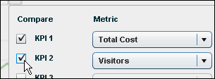
The following steps for choosing KPI options apply in both cases.
2. In the Metric column, click the drop-down list that displays Visitors, and then select the metric you want.
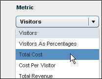
3. In the Segments column, click the drop-down list that displays All visitors, and then choose the segment you want.
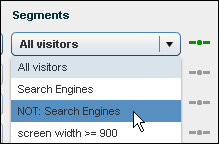
NOTE The short line to the right of the list indicates the color of the line on the graph--in the example above, the line displays as dark green.
4. When you are finished, click Apply.
To choose a general timeframe for the graph
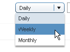
Click the drop-down list that displays Daily, and then select the timeframe you want.
To choose a specific date range
1. Click the button next to the Date box.

2. In the dialog that appears, click the graphic next to the first Date Range box.
To use one of the built-in custom date ranges
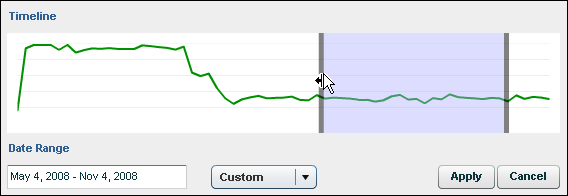
Click the Custom drop-down list, and then select the range you want.

To set a specific date range
Drag the shaded date range indicator.
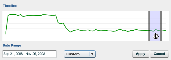
The date range changes depending on where you drag in the timeline; this change is indicated in the Date Range box.
To change the size of the indicator (this adjusts the length of the date range)
Drag its right edge towards the right, or its left edge towards the left. The date range adjusts dynamically as you drag, as indicated in the Date Range box.
To type a new date range
1. Click inside the Date Range box.

The Date Range dialog appears.
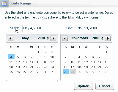
You can use one of the following methods to select a date range:
1. To select a starting date, click a date in the calendar on the left. You can choose a different month by clicking the forward or back arrows ...

... or change the year by clicking the up/down arrows.

2. Select an end date in the right side calendar or End box using the methods described above.
3. When you are finished, click the Update button.
To view the data for a specific point in time
Move the pointer over the line in the graph. Here is a graph set to "Daily:"
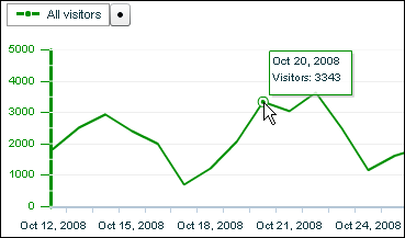
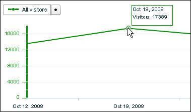
The data point usually occurs where there is a bend in the line. Here's the readout for a graph set to "Weekly":
To show or hide the KPI Graph
Click the Show/Hide button in the upper right corner of the page.

When the left side of the button is selected, the graph is displayed. When the right side is selected, the graph is hidden.
To change your dataset
1. Click the Change Dataset button located in the upper right of the screen.

2. In the dialog that appears, click the drop-down list under Select Dataset, and then make your selection.
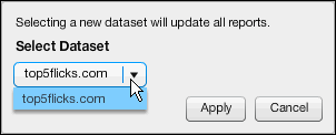
3. When you are finished, click the Apply button.
Reports
To view a report
Click the Report drop-down list, and then select the report you want.
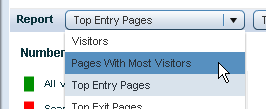
To choose a timeframe for your selected report
Click the Date drop-down list, and then select the timeframe you want.

To select the segments you want represented in the report
1. Click the Filter button

The Filter Options dialog appears.
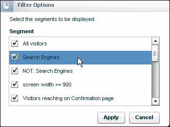
2. Select or clear the segments you want, and then click the Apply button.
1. Visitors
Includes the following sub-metrics:
2. Cost of Visitors
Includes the following sub-metrics: **
3. Revenue from Visitors
Includes the following sub-metrics: **
** The sub-metrics appear only when the general timeframe is set to Total. They do not appear when it is set to Day, Week, or Month.
4. Top Search Keywords
Shows the popular search keywords averaged across all search engines. The Search Report provides a breakdown of keyword by engine, but cannot show trends over time. This report can make such trends easier to spot.
5. Top Referrers
The number of visitors who were at an external site before clicking through into your site. By definition, "external" sites are those not listed as alternate domain names.
6. Pages with Most Visitors
Pages that are seen most often by visitors. Multiple views of the same page are not counted if they occur within the same session.
7. Top Entry Pages
Most common entry points to the site.
8. Top Exit Pages
Most common exist points from the site.
9. Top Destinations
Most common pages that users go to after exiting the site.
10. Internal Parameters
Shows you the most frequently requested values for any given parameter or cookie.
11. Countries with Most Visitors
Lyris HQ uses a GeoIP database to determine the country where visitors are coming from. This is far more accurate than the old method of examining the domain name of the visitor ( .com, .edu, .fr, .co.jp etc. ).
12. Regions with Most Visitors
To view the sub-regions for a particular region, click the Region drop-down list, and then select a different region. (Example: for the United States, the subregions are states).

13. Organizations with Most Visitors
Breaks down visitors to a Web site by organization (ISPs, companies, universities, government entities, etc.). The data is gathered by comparing the IP address of a visitor against a database of organizations that are associated with each IP address.
14. Browsers
Breaks down visitors according to the type of browser they are using.
15. Operating Systems
Breaks down visitors according to the type of operating system they are using.
16. Screen Size
Breaks down visitors according to their screen resolution.